Part 3: Reduce Dimensions with PCA#
This script demonstrates how to perform dimensionality reduction using Principal Component Analysis (PCA) on a dataset of extracted features. It visualizes the normalized features, the principal components, and how much variance each component explains.
Make sure to have the required features.npz file in the correct path.
import numpy as np
import matplotlib.pyplot as plt
from sklearn.decomposition import PCA
3.1 Load and Normalize the Features#
FEATURE_TYPE = 'designed'  # 'psd' or 'designed'
NORMALIZE = True # True or False, whether to normalize the features
# load the features
data = np.load('../data/features.npz')
timestamps_hrs = data['timestamps_features']
if FEATURE_TYPE == 'psd':
    features = data['psd_features']
elif FEATURE_TYPE == 'designed':
    features = data['designed_features']
# minmax normalize the features by column
if NORMALIZE:
    features = (features - np.min(features, axis=0)) / (np.max(features, axis=0) - np.min(features, axis=0))
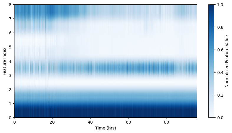
# visualize the features
plt.figure(figsize=(10, 5))
plt.imshow(features.T, aspect='auto', origin='lower', extent=[timestamps_hrs[0], timestamps_hrs[-1], 0, features.shape[1]], cmap='Blues')
plt.colorbar(label='Normalized Feature Value')
plt.xlabel('Time (hrs)')
plt.ylabel('Feature Index')
Text(0, 0.5, 'Feature Index')
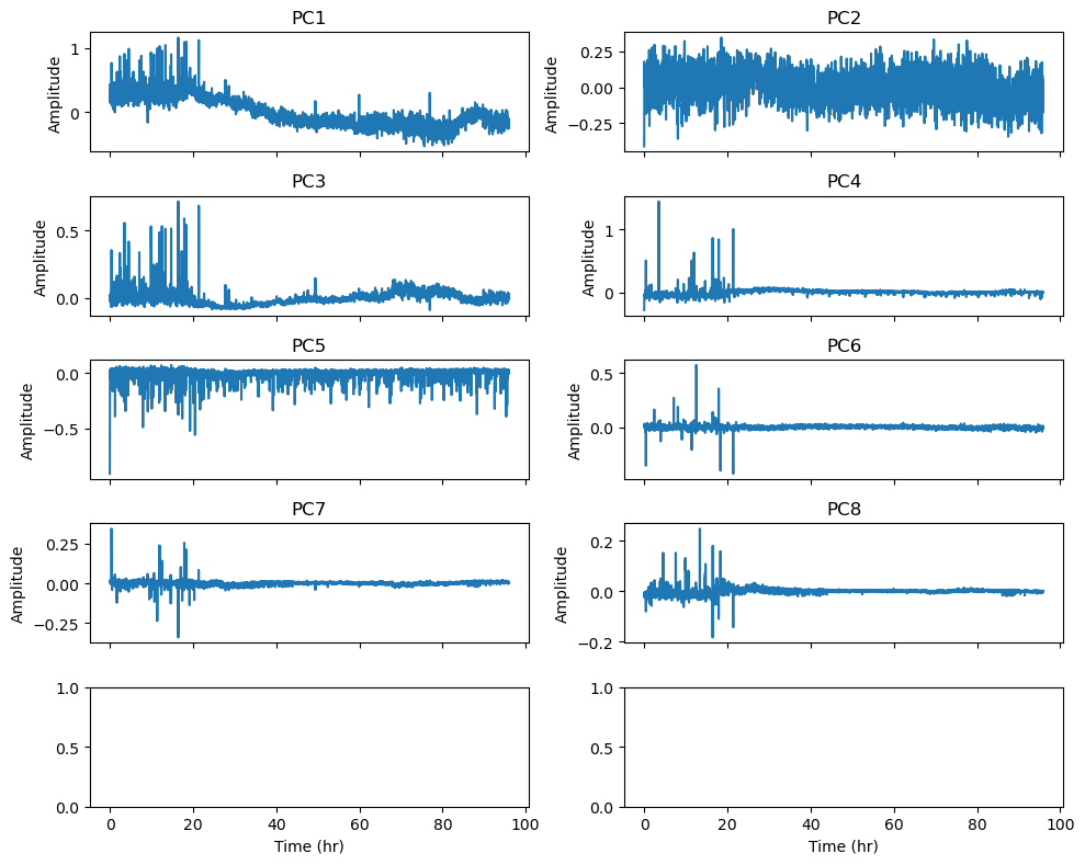
3.2 Apply PCA and visualize the results#
N_COMPONENTS = 8 # number of PCA components, maximum depends on the number of features
# reduce the dimensionality of the features
pca = PCA(n_components=N_COMPONENTS)
pca_features = pca.fit_transform(features)
fig, ax = plt.subplots(N_COMPONENTS // 2+1, 2, figsize=(10, N_COMPONENTS), sharex=True)
for i in range(N_COMPONENTS):
    ax[i // 2, i % 2].plot(timestamps_hrs, pca_features[:, i])
    ax[i // 2, i % 2].set_title(f'PC{i + 1}')
    ax[i // 2, i % 2].set_ylabel('Amplitude')

ax[-1, -1].set_xlabel('Time (hr)')
ax[-1, 0].set_xlabel('Time (hr)')
plt.tight_layout()
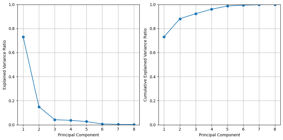
# show the explained variance and the cumulative explained variance
explained_variance = pca.explained_variance_ratio_
fig, axes = plt.subplots(1,2,figsize=(10, 5), sharex=True)
axes[0].plot(range(1, 9), explained_variance, marker='o')
axes[0].set_xlabel('Principal Component')
axes[0].set_ylabel('Explained Variance Ratio')
axes[0].set_xticks(range(1, 9))
axes[0].set_xticklabels(range(1, 9))
axes[0].set_ylim(0, 1)
axes[0].grid()

axes[1].plot(range(1, 9), np.cumsum(explained_variance), marker='o')
axes[1].set_xlabel('Principal Component')
axes[1].set_ylabel('Cumulative Explained Variance Ratio')
axes[1].set_ylim(0, 1)
axes[1].grid()
plt.tight_layout()
plt.show()
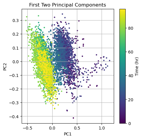
# show the first two principal components
fig, ax = plt.subplots(figsize=(5, 5))
#ax.scatter(pca_features[:, 0], pca_features[:, 1], s=5)
img = ax.scatter(pca_features[:, 0], pca_features[:, 1], s=5, c=timestamps_hrs, cmap='viridis')
ax.set_title('First Two Principal Components')
ax.set_xlabel('PC1')
ax.set_ylabel('PC2')
ax.grid()
#ax.set_aspect('equal', adjustable='box')
# add color bar
cbar = plt.colorbar(img)
cbar.set_label('Time (hr)')
plt.show()