Binary Classification of the PIMA Indians Diabetes Dataset#
This notebook demonstrates a machine learning workflow for binary classification:
predicting whether a patient has diabetes based on clinical features.
Key challenges: class imbalance and moderate dataset size
Steps in this notebook#
Load the dataset
Import data and perform initial exploration
Preprocess the data
Train/test split
Standard scaling of numeric features
Train a baseline model
Logistic Regression
Evaluate model performance
Confusion matrix, sensitivity, specificity, accuracy
ROC curve and AUROC
Precision–Recall curve and Average Precision (for imbalanced data)
Explore decision thresholds
Threshold analysis to select an optimal operating point
Make predictions
Example prediction with clinical input features
Dataset#
Pima Indians Diabetes Dataset (UCI classic): each row represents a patient with clinical measurements such as age, BMI, blood pressure, glucose, insulin, pregnancies, and a binary outcome (
1 = diabetes,0 = no diabetes).
Import libraries#
import pandas as pd
import numpy as np

from sklearn.model_selection import train_test_split
from sklearn.preprocessing import StandardScaler
from sklearn.linear_model import LogisticRegression
from sklearn.metrics import (
    classification_report, confusion_matrix, accuracy_score, precision_score, recall_score,
    roc_curve, roc_auc_score, precision_recall_curve, average_precision_score
)
import seaborn as sns
import matplotlib.pyplot as plt
1. Load the dataset#
file_path = "./PIMA_Indians_Diabetes.csv"
data = pd.read_csv(file_path)
print(f"Dataset dimensions: {data.shape}\n")
data.head()
Dataset dimensions: (768, 9)
| Age | BMI | BloodPressure | Glucose | Insulin | SkinThickness | Pregnancies | DiabetesPedigree | Outcome | |
|---|---|---|---|---|---|---|---|---|---|
| 0 | 50 | 33.6 | 72 | 148 | 0 | 35 | 6 | 0.627 | 1 |
| 1 | 31 | 26.6 | 66 | 85 | 0 | 29 | 1 | 0.351 | 0 |
| 2 | 32 | 23.3 | 64 | 183 | 0 | 0 | 8 | 0.672 | 1 |
| 3 | 21 | 28.1 | 66 | 89 | 94 | 23 | 1 | 0.167 | 0 |
| 4 | 33 | 43.1 | 40 | 137 | 168 | 35 | 0 | 2.288 | 1 |
2. Preprocessing the data#
Split into features (X) and target (y)#
X = data.drop("Outcome", axis=1)
y = data["Outcome"]
Create training and test sets with stratification to preserve class balance#
X_train, X_test, y_train, y_test = train_test_split(
    X, y, test_size=0.2, random_state=21, stratify=y
)
Standardize features to improve model performance#
scaler = StandardScaler()
X_train_scaled = scaler.fit_transform(X_train)
X_test_scaled = scaler.transform(X_test)
3. Train a baseline ML model#
Logistic Regression is a good baseline for binary classification#
model = LogisticRegression(max_iter=1000, random_state=21)
model.fit(X_train_scaled, y_train)
LogisticRegression(max_iter=1000, random_state=21)In a Jupyter environment, please rerun this cell to show the HTML representation or trust the notebook.
On GitHub, the HTML representation is unable to render, please try loading this page with nbviewer.org.
Parameters
| penalty | 'l2' | |
| dual | False | |
| tol | 0.0001 | |
| C | 1.0 | |
| fit_intercept | True | |
| intercept_scaling | 1 | |
| class_weight | None | |
| random_state | 21 | |
| solver | 'lbfgs' | |
| max_iter | 1000 | |
| multi_class | 'deprecated' | |
| verbose | 0 | |
| warm_start | False | |
| n_jobs | None | |
| l1_ratio | None |
4. Evaluate the model performance#
Predictions#
y_pred = model.predict(X_test_scaled)
y_pred_prob = model.predict_proba(X_test_scaled)[:, 1]
print("\nClassification Report:\n", classification_report(y_test, y_pred))
print("Accuracy:", accuracy_score(y_test, y_pred))
Classification Report:
               precision    recall  f1-score   support

           0       0.76      0.89      0.82       100
           1       0.70      0.48      0.57        54

    accuracy                           0.75       154
   macro avg       0.73      0.69      0.70       154
weighted avg       0.74      0.75      0.73       154

Accuracy: 0.7467532467532467
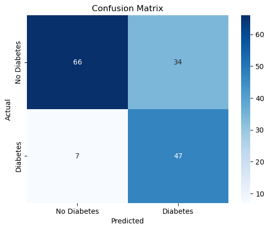
Confusion matrix visualization#
cm = confusion_matrix(y_test, y_pred)
sns.heatmap(
    cm, annot=True, fmt="d", cmap="Blues",
    xticklabels=["No Diabetes", "Diabetes"],
    yticklabels=["No Diabetes", "Diabetes"]
)
plt.title("Confusion Matrix")
plt.xlabel("Predicted")
plt.ylabel("Actual")
plt.show()
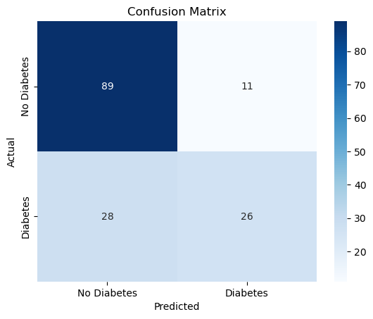
Sensitivity (Recall for positive class) and Specificity (Recall for negative class)#
TN, FP, FN, TP = cm.ravel()
sensitivity = TP / (TP + FN)
specificity = TN / (TN + FP)
print(f"Sensitivity (Recall for Diabetes): {sensitivity:.2f}")
print(f"Specificity (Recall for No Diabetes): {specificity:.2f}")
Sensitivity (Recall for Diabetes): 0.48
Specificity (Recall for No Diabetes): 0.89
ROC curve and AUC#
fpr, tpr, thresholds = roc_curve(y_test, y_pred_prob)
auc = roc_auc_score(y_test, y_pred_prob)
plt.plot(fpr, tpr, label=f"ROC curve (AUC = {auc:.2f})")
plt.plot([0, 1], [0, 1], linestyle="--", color="gray")
plt.xlabel("False Positive Rate")
plt.ylabel("True Positive Rate")
plt.title("Receiver Operating Characteristic (ROC)")
plt.legend()
plt.grid(alpha=0.3)
plt.show()
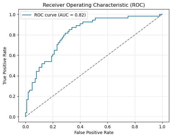
print(f"AUROC: {auc:.2f}")
AUROC: 0.82
Precision-Recall curve (useful for imbalanced datasets)#
precision, recall, pr_thresholds = precision_recall_curve(y_test, y_pred_prob)
avg_precision = average_precision_score(y_test, y_pred_prob)
plt.plot(recall, precision, label=f"AP = {avg_precision:.2f}")
plt.xlabel("Recall")
plt.ylabel("Precision")
plt.title("Precision-Recall Curve")
plt.legend()
plt.grid(alpha=0.3)
plt.show()
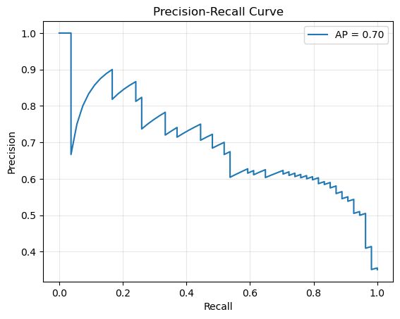
print(f"Average Precision Score: {avg_precision:.2f}")
Average Precision Score: 0.70
5. Explore decision thresholds#
Identify an optimal threshold using Youden’s J statistic#
def evaluate_threshold(threshold: float):
    """
    Evaluate accuracy, sensitivity, and specificity at a given threshold
    """
    y_pred_thresh = (y_pred_prob >= threshold).astype(int)
    cm_thresh = confusion_matrix(y_test, y_pred_thresh)
    TN, FP, FN, TP = cm_thresh.ravel()
    sensitivity = TP / (TP + FN)
    specificity = TN / (TN + FP)
    acc = accuracy_score(y_test, y_pred_thresh)
    return acc, sensitivity, specificity
Try a few example thresholds
for t in [0.3, 0.5, 0.7]:
    acc, sens, spec = evaluate_threshold(t)
    print(f"Threshold = {t:.2f} | Accuracy = {acc:.2f} | Sensitivity = {sens:.2f} | Specificity = {spec:.2f}")
Threshold = 0.30 | Accuracy = 0.74 | Sensitivity = 0.72 | Specificity = 0.75
Threshold = 0.50 | Accuracy = 0.75 | Sensitivity = 0.48 | Specificity = 0.89
Threshold = 0.70 | Accuracy = 0.72 | Sensitivity = 0.30 | Specificity = 0.95
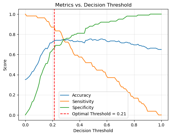
Plot metrics across a range of thresholds#
thresholds = np.linspace(0, 1, 100)
accuracies, sensitivities, specificities, j_scores = [], [], [], []

for thr in thresholds:
    acc, sens, spec = evaluate_threshold(thr)
    accuracies.append(acc)
    sensitivities.append(sens)
    specificities.append(spec)
    j_scores.append(sens + spec - 1)  # Youden's J statistic
Find optimal threshold (maximizes Youden’s J statistic)#
balance sensitivity and specificity
optimal_idx = np.argmax(j_scores)
optimal_threshold = thresholds[optimal_idx]
optimal_acc, optimal_sens, optimal_spec = evaluate_threshold(optimal_threshold)
print(f"Optimal threshold by Youden's J: {optimal_threshold:.2f}")
print(f"At optimal threshold -> Accuracy: {optimal_acc:.2f}, Sensitivity: {optimal_sens:.2f}, Specificity: {optimal_spec:.2f}")
Optimal threshold by Youden's J: 0.21
At optimal threshold -> Accuracy: 0.73, Sensitivity: 0.87, Specificity: 0.66
Plot Accuracy, Sensitivity, and Specificity curves with optimal threshold marked#
plt.plot(thresholds, accuracies, label="Accuracy")
plt.plot(thresholds, sensitivities, label="Sensitivity")
plt.plot(thresholds, specificities, label="Specificity")
plt.axvline(
    optimal_threshold, color="red", linestyle="--",
    label=f"Optimal Threshold = {optimal_threshold:.2f}"
)
plt.xlabel("Decision Threshold")
plt.ylabel("Score")
plt.title("Metrics vs. Decision Threshold")
plt.legend()
plt.grid(alpha=0.3)
plt.show()
Confusion Matrix for the optimal threshold#
def cm_threshold(threshold: float):
    """
    Get confusion matrix a given threshold.
    """
    y_pred_thresh = (y_pred_prob >= threshold).astype(int)
    cm_thresh = confusion_matrix(y_test, y_pred_thresh)
    return cm_thresh
cm = cm_threshold(optimal_threshold)
sns.heatmap(
    cm, annot=True, fmt="d", cmap="Blues",
    xticklabels=["No Diabetes", "Diabetes"],
    yticklabels=["No Diabetes", "Diabetes"]
)
plt.title("Confusion Matrix")
plt.xlabel("Predicted")
plt.ylabel("Actual")
plt.show()
6. Make prediction#
Prediction at default threshold
example = pd.DataFrame([{'Age':85, 'BMI':25.5, 'BloodPressure':70, 'Glucose':120, 'Insulin':79, 'SkinThickness':20,
                         'Pregnancies':2, 'DiabetesPedigree':0.35}])
example_scaled = scaler.transform(example)

pred = model.predict(example_scaled)

status = {0: "No Diabetes", 1: "Diabetes"}

print(f"Example prediction: {pred[0]} => {status.get(pred[0])}")
Example prediction: 0 => No Diabetes
Prediction at optimal threshold
prob = model.predict_proba(example_scaled)[0, 1]
pred_at_optimal = int(prob >= optimal_threshold)

print(f"Example probability of diabetes: {prob:.2f}")
print(f"Example prediction at optimal threshold ({optimal_threshold:.2f}): {pred_at_optimal} => {status.get(pred_at_optimal)}")
Example probability of diabetes: 0.26
Example prediction at optimal threshold (0.21): 1 => Diabetes