Regression with scikit-learn#
We want to explore how to use scikit-learn for linear regression. This includes preparing the data, training the model, and evaluating and visualizing the results.
We will use the following modules for this:
sklearn.datasets: Tools for using common datasets for ML or for generating synthetic data
sklearn.model_selection: Tools for data splitting, cross-validation, and parameter tuning
sklearn.linear_model: Collection of linear models for regression and classification
sklearn.metrics: Collection of various metrics for model evaluation
In general, also refer to the comprehensive User Guide on linear models from scikit-learn.
# Just in case we need help
# Import bia-bob as a helpful Python & Medical AI expert
import os
from bia_bob import bob

bob.initialize(
    endpoint=os.getenv('ENDPOINT_URL'),
    model="vllm-llama-4-scout-17b-16e-instruct",
    system_prompt=os.getenv('SYSTEM_PROMPT_MEDICAL_AI')
)
%bob Who are you ? Just 1 sentence!
I’m an expert in medical data science and a skilled Python programmer and data analyst with extensive experience working with various medical datasets and applying data analysis, machine learning, and deep learning techniques.
Regression on synthetic data#
Data preparation#
For a start and to show the concepts of model training with scikit-learn, we generate synthetic data for a simple regression problem.
We use make_regression:
To get 500 data points (samples) with one feature each in
X,To predict a target variable
y,And add some noise
from sklearn.datasets import make_regression

# We use the established notation: X for Features, y for Target
X, y = make_regression(
    n_samples=500,
    n_features=1,
    noise=30.0,
    random_state=42
)
Let’s examine some basic properties of the data
print("Type X:", type(X))
print("Shape X:", X.shape)
print("First X:", X[0])
print("Type y:", type(y))
print("Shape y:", y.shape)
print("First y:", y[0])
Type X: <class 'numpy.ndarray'>
Shape X: (500, 1)
First X: [-0.80829829]
Type y: <class 'numpy.ndarray'>
Shape y: (500,)
First y: -37.79251664264387
As we can see, the data is be provided as NumPy ndarray.
To make the data a little more convenient to work with, we can also load it into a pandas dataframe.
import pandas as pd

df = pd.DataFrame(data=X, columns=['feature'])
df['target'] = y
Pandas provides quite useful methods to get an overview on the data.
# Information about the variables, datatypes, and missing data.
df.info()
<class 'pandas.core.frame.DataFrame'>
RangeIndex: 500 entries, 0 to 499
Data columns (total 2 columns):
 #   Column   Non-Null Count  Dtype
---  ------   --------------  -----
 0   feature  500 non-null    float64
 1   target   500 non-null    float64
dtypes: float64(2)
memory usage: 7.9 KB
# Descriptive statistics for numerical variables
df.describe().T
| count | mean | std | min | 25% | 50% | 75% | max | |
|---|---|---|---|---|---|---|---|---|
| feature | 500.0 | 0.006838 | 0.981253 | -3.241267 | -0.700307 | 0.012797 | 0.636783 | 3.852731 |
| target | 500.0 | -0.745152 | 68.555808 | -241.992474 | -47.360061 | -2.164537 | 37.533155 | 270.931008 |
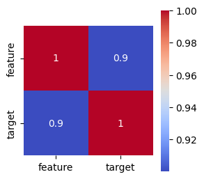
We also can compute and plot the correlation matrix of the data to see how our feature correlates with the target
import matplotlib.pyplot as plt
import seaborn as sns

# Get the correlation matrix
corr = df.corr()

# Visualize the correlation matrix as heatmap
plt.figure(figsize=(3, 3))
sns.heatmap(corr, annot=True, cmap='coolwarm', square=True)
plt.show()
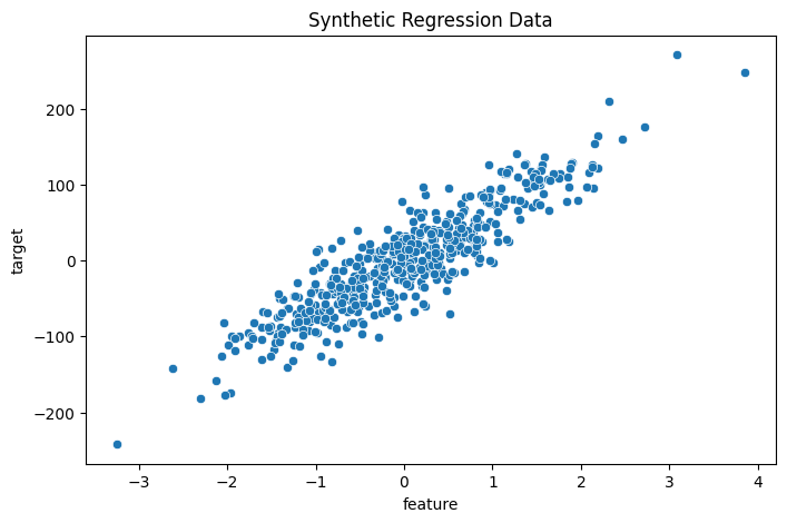
Let’s visualize the generated data to get a better understanding.
# Create a scatterplot with seaborn
plt.figure(figsize=(8, 5))
sns.scatterplot(data=df, x='feature', y='target')
plt.title('Synthetic Regression Data')
plt.show()
Train-test split#
Now we split the data for training and model testing / evaluation in order to verify the generalization of the trained model on unknown data.
For this purpose, we can use train_test_split.
from sklearn.model_selection import train_test_split

# Split: 80% training, 20% test
X_train, X_test, y_train, y_test = train_test_split(X, y, test_size=0.2, random_state=42)

print("training data:", X_train.shape, "training labels:", y_train.shape)
print("test data:", X_test.shape, "test labels:", y_test.shape)
training data: (400, 1) training labels: (400,)
test data: (100, 1) test labels: (100,)
Select and train a model#
We import the model
LinearRegressionand initialize the corresponding Python object using()Model training is started using the method
.fit()— almost all models and algorithms in scikit-learn have this methodWe pass the training data to this method, divided into features
X_trainand targety_trainThe model parameters are now adjusted to predict the target as accurately as possible based on the associated feature
from sklearn.linear_model import LinearRegression

# Initialize model
model = LinearRegression()
# Supervised training - “Fitting” the model to the training data with known labels
model.fit(X_train, y_train)
LinearRegression()In a Jupyter environment, please rerun this cell to show the HTML representation or trust the notebook.
On GitHub, the HTML representation is unable to render, please try loading this page with nbviewer.org.
Parameters
Prediction and evaluation#
We now want to check how well the model can predict the target for previously unknown features.
The prediction is performed using the method
.predict()– almost all models and algorithms in scikit-learn have this method.We pass the features of the test data to this method and receive the corresponding predictions of the target.
# Prediction on unseen test data
y_pred = model.predict(X_test)
We can now compare the predictions with the known target values of the test data and derive metrics for evaluating the model quality.
A metric provided by LinearRegression itself is the so-called
r2score (coefficient of determination of a regression), which evaluates the overall goodness of fitOther suitable regression metrics are described, for example, in the User Guide - Regression Metrics
We also choose the Mean Absolute Error (MAE)
In general, it makes sense to calculate several metrics in order to get a better impression of the model quality
from sklearn.metrics import mean_absolute_error

# Metrics for determining model quality

# r^2 score, between 0.0 and 1.0, higher is better
r2_score = model.score(X_test, y_test)
print(f"r^2 score on test data: {r2_score:.3f}")

# Calculate mean absolute error (MAE), the best is 0.0
mse = mean_absolute_error(y_test, y_pred)
print(f"Mean Absolute Error (MAE) on test data: {mse:.3f}")
r^2 score on test data: 0.808
Mean Absolute Error (MAE) on test data: 23.094
In addition, some models offer the option to retrieve the adjusted model parameters. For LinearRegression, these are:
Regression coefficient (slope): the slope of the regression line
Intercept: intersection with the y-axis
# Output of the learned model parameters
print("Regression coefficient:", model.coef_)
print("Intercept:", model.intercept_)
Regression coefficient: [62.07145267]
Intercept: -1.5459169069668393
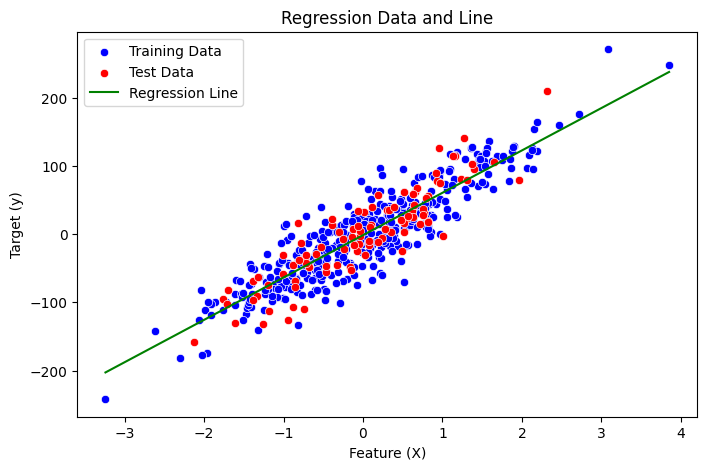
Visualization of the results#
Finally, let’s visualize all aspects for a better understanding:
The distribution of training data
The distribution of test data
The regression line generated by our model
Sound’s complicated, right? Let’s ask our assistant bia-bob!
%%bob
From a trained regression model, I have this variables:
* training data: X_train with shape {X_train.shape}, y_train with shape {y_train.shape}
* test data: X_test with shape {X_test.shape}, y_test with shape {y_test.shape}
* trained schikit-learn LinearRegression model: {model}

I want you to visualize training data, test data, and regression line of the trained model in one plot using seaborn.
Here’s a Python code snippet to visualize the training data, test data, and regression line of the trained model using seaborn:
# Import necessary libraries
import pandas as pd
import numpy as np

# Create a pandas DataFrame for training and test data
df_train = pd.DataFrame({'X': X_train.flatten(), 'y': y_train})
df_test = pd.DataFrame({'X': X_test.flatten(), 'y': y_test})

# Create a scatterplot with seaborn
plt.figure(figsize=(8, 5))
sns.scatterplot(data=df_train, x='X', y='y', label='Training Data', color='blue')
sns.scatterplot(data=df_test, x='X', y='y', label='Test Data', color='red')

# Plot regression line
x_range = np.linspace(X_train.min(), X_train.max()).reshape(-1, 1)
y_pred_line = model.predict(x_range)
plt.plot(x_range, y_pred_line, label='Regression Line', color='green')

# Set labels and title
plt.xlabel('Feature (X)')
plt.ylabel('Target (y)')
plt.title('Regression Data and Line')
plt.legend()

# Show the plot
plt.show()
Exercise: Regression on Diabetes Data#
Now we want to train a regression model on the more complex scikit-learn diabetes dataset.
This data contains variables for age, sex, body mass index, average blood pressure, and blood serum measurements obtained for 422 diabetes patients. The target value we want to predict is a quantitative measure of disease progression one year after baseline.
If you get stuck, remember that our assistant bia-bob is available and very happy to help you.
Data preparation#
from sklearn.datasets import load_diabetes
diabetes = load_diabetes()
# Check the available methods / objects first
dir(diabetes)
['DESCR',
 'data',
 'data_filename',
 'data_module',
 'feature_names',
 'frame',
 'target',
 'target_filename']
# Let's get our X,y first
X = diabetes.data
y = diabetes.target
# And here we also have proper labels for our features
feature_labels = diabetes.feature_names
print("Type X:", type(X))
print("Shape X:", X.shape)
print("First X:", X[0])
print("Labels X:", feature_labels)
Type X: <class 'numpy.ndarray'>
Shape X: (442, 10)
First X: [ 0.03807591  0.05068012  0.06169621  0.02187239 -0.0442235  -0.03482076
 -0.04340085 -0.00259226  0.01990749 -0.01764613]
Labels X: ['age', 'sex', 'bmi', 'bp', 's1', 's2', 's3', 's4', 's5', 's6']
print("Type y:", type(y))
print("Shape y:", y.shape)
print("First y:", y[0])
Type y: <class 'numpy.ndarray'>
Shape y: (442,)
First y: 151.0
# ToDo: understand the data better
Train-test split#
# ToDo: create data for training and test
Select and train a model#
# ToDo: initialize and train a regression model
Prediction and evaluation#
# ToDo: evaluate the model quality