Plotting Distributions with Seaborn#
Seaborn is also very practical to plot data distributions. We start with simple histograms and kde. Then, we show how to plot boxplots, violinplots and bar graphs.
import pandas as pd
import numpy as np
import seaborn as sns
sns.set_theme()
Load the dataframe#
df = pd.read_csv("data/BBBC007_analysis.csv")
df.head()
| area | intensity_mean | major_axis_length | minor_axis_length | aspect_ratio | file_name | |
|---|---|---|---|---|---|---|
| 0 | 139 | 96.546763 | 17.504104 | 10.292770 | 1.700621 | 20P1_POS0010_D_1UL |
| 1 | 360 | 86.613889 | 35.746808 | 14.983124 | 2.385805 | 20P1_POS0010_D_1UL |
| 2 | 43 | 91.488372 | 12.967884 | 4.351573 | 2.980045 | 20P1_POS0010_D_1UL |
| 3 | 140 | 73.742857 | 18.940508 | 10.314404 | 1.836316 | 20P1_POS0010_D_1UL |
| 4 | 144 | 89.375000 | 13.639308 | 13.458532 | 1.013432 | 20P1_POS0010_D_1UL |
Distribution Plots#
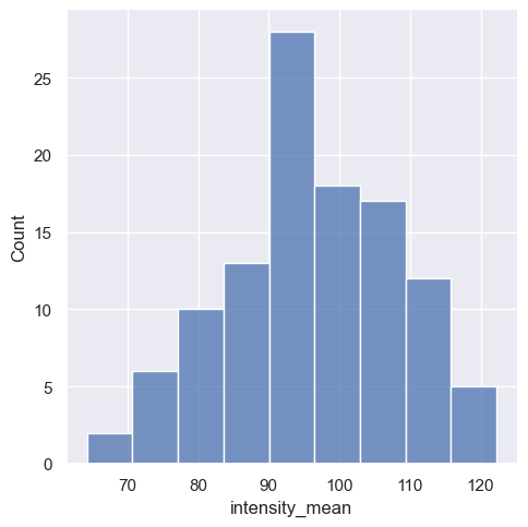
The Seaborn function for distributions is sns.displot(), whereby the histogram is the standard display type.
sns.displot(data=df,
            x="intensity_mean");
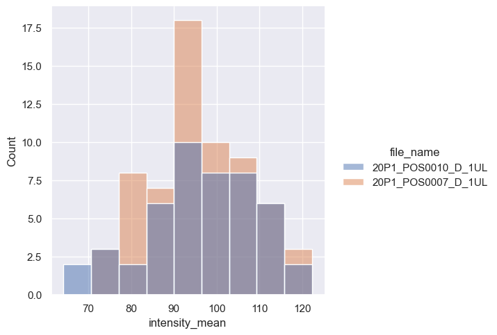
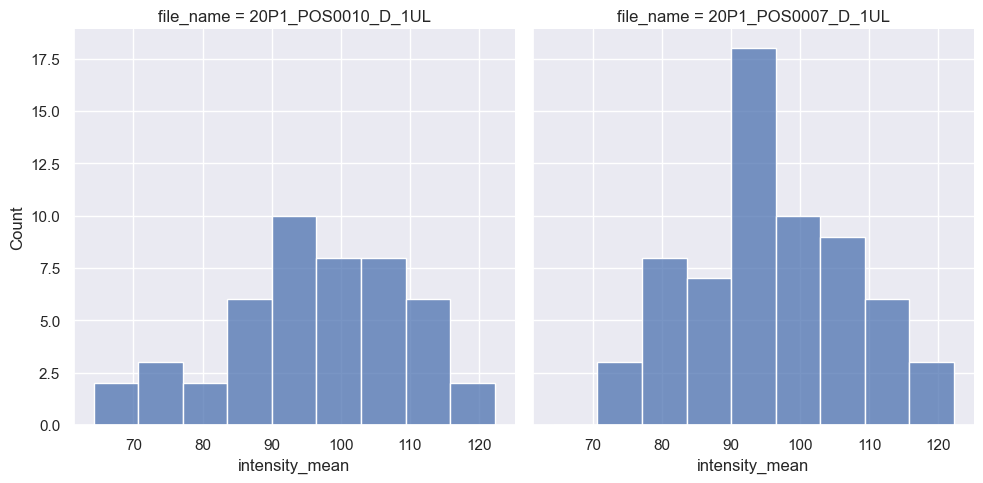
Again, we have the option to either display the distributions of the individual files in a single diagram with different colors or split them into two sub-diagrams. The choice depends on the argument to which we pass the file_name parameter: either hue for coloring within a single diagram or col for creating separate sub-diagrams. Let’s try both.
sns.displot(data=df,
            x="intensity_mean",
            hue="file_name");     # Display a different color for each file
sns.displot(data=df,
            x="intensity_mean",
            col="file_name");       # Display a different subplot for each file
We can also add the kernel density estimation (kde) by passing kde=True. Just be careful while interpreting these plots (check some pitfalls here).
sns.displot(data=df,
            x="intensity_mean",
            hue="file_name",
            kde=True);

Boxplots#
Categorial variables are plotted with the function sns.catplot().
sns.catplot(data=df,
            x="file_name",
            y="intensity_mean",
            kind="box");
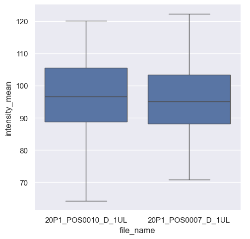
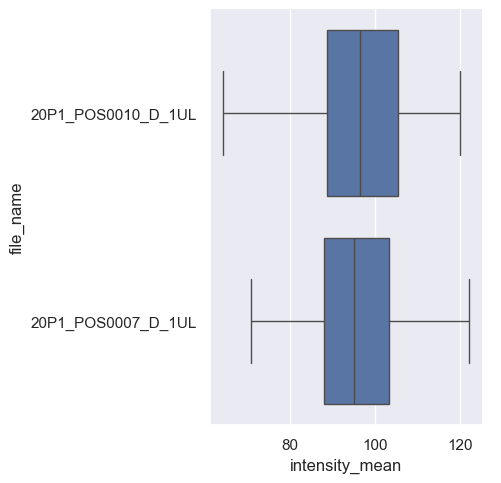
Seaborn automatically identifies file_name as a categorical variable and intensity_mean as a numerical value. Thus, it plots boxplots for the intensity variable. If we invert x and y, we still get the same graph, but as horizontal boxplots.
sns.catplot(data=df,
            x="intensity_mean",
            y="file_name",
            kind="box");
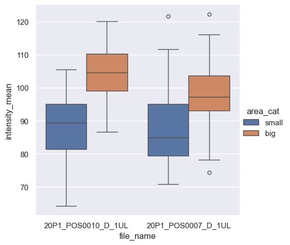
We can display advanced visualizations, such as side-by-side boxplots, which are particularly useful for comparing pairs of categorical data.
First, we need to create a second categorical variable by splitting the observations into two categories depending on the size of their areas.
df['area_cat'] = np.where(df['area'] > 250, 'big', 'small')
df.head()
| area | intensity_mean | major_axis_length | minor_axis_length | aspect_ratio | file_name | area_cat | |
|---|---|---|---|---|---|---|---|
| 0 | 139 | 96.546763 | 17.504104 | 10.292770 | 1.700621 | 20P1_POS0010_D_1UL | small |
| 1 | 360 | 86.613889 | 35.746808 | 14.983124 | 2.385805 | 20P1_POS0010_D_1UL | big |
| 2 | 43 | 91.488372 | 12.967884 | 4.351573 | 2.980045 | 20P1_POS0010_D_1UL | small |
| 3 | 140 | 73.742857 | 18.940508 | 10.314404 | 1.836316 | 20P1_POS0010_D_1UL | small |
| 4 | 144 | 89.375000 | 13.639308 | 13.458532 | 1.013432 | 20P1_POS0010_D_1UL | small |
sns.catplot(data=df,
            x='file_name',
            y='intensity_mean',
            kind='box',
            hue='area_cat');   # Display side-by-side boxplots for each file_name and area_cat
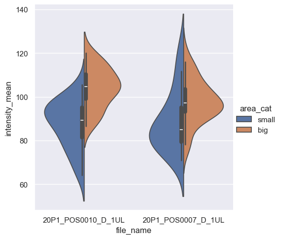
If you only change the parameter kind from box to violin, we get a violin plot. By providing split=True, we can further customize the plot.
sns.catplot(data=df,
            x='file_name',
            y='intensity_mean',
            hue='area_cat',
            kind='violin',
            split=True);     # Display side-by-side violin plots for each file_name and area_cat
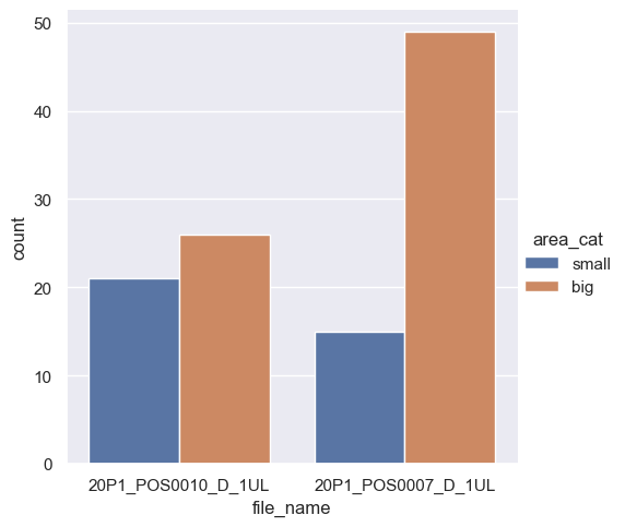
In a similar way, we get the count for categorical variables with the parameter count.
sns.catplot(data=df,
            x="file_name",
            hue='area_cat',
            kind="count");   # Count plot: "histogram" across a categorical, instead of quantitative, variable
Exercise#
You will create a figure with four subplots to visualize the empirical cumulative distribution functions (ECDFs) for the area variable. Each subplot will display the ECDF for different categories based on file_name and area_cat. The rows will correspond to the file_name and the columns to the variable area_cat.
Hint: explore the function displot in the Seaborn documentation.
# Your code here