Plotly basic usage#
This notebook demonstrates basic Plotly usage step-by-step. We install dependencies, create a small dataset, make a few plots, and save everything to disk for later inspection.
plotly’s API is similar but not identical to seaborn. For example, both are based on DataFrames, but what seaborn calls hue is color in plotly.
import pandas as pd
import plotly.express as px
Generate a small demo DataFrame with time series data and some categories.
df = pd.read_csv("data/blobs_measurements.csv")
df.head()
| Unnamed: 0 | label | area | mean_intensity | max_intensity | min_intensity | centroid-0 | centroid-1 | eccentricity | solidity | perimeter | centroid_x | centroid_y | |
|---|---|---|---|---|---|---|---|---|---|---|---|---|---|
| 0 | 0 | 1 | 27.0 | 149.333333 | 168.0 | 128.0 | 26.259259 | 0.666667 | 0.973991 | 0.900000 | 20.621320 | 0.666667 | 26.259259 |
| 1 | 1 | 2 | 203.0 | 199.960591 | 240.0 | 128.0 | 225.876847 | 3.955665 | 0.892348 | 0.966667 | 59.591883 | 3.955665 | 225.876847 |
| 2 | 2 | 3 | 503.0 | 198.695825 | 248.0 | 128.0 | 97.487078 | 7.836978 | 0.801503 | 0.971042 | 86.870058 | 7.836978 | 97.487078 |
| 3 | 3 | 4 | 264.0 | 189.939394 | 232.0 | 120.0 | 139.545455 | 7.159091 | 0.605384 | 0.977778 | 58.041631 | 7.159091 | 139.545455 |
| 4 | 4 | 5 | 96.0 | 166.416667 | 200.0 | 128.0 | 44.812500 | 7.833333 | 0.628475 | 0.960000 | 34.142136 | 7.833333 | 44.812500 |
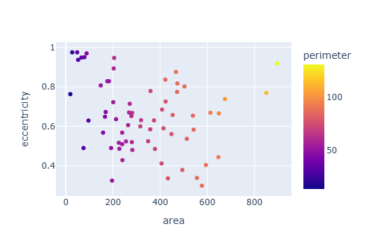
Create a scatter plot colored by category and sized by the “size” column.
px.scatter(
    df,
    x="area",
    y="eccentricity",
    color="perimeter"
)
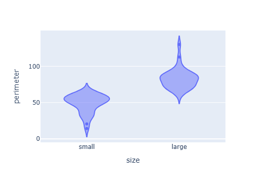
Violin plots allow us to split the data into groups and visualize their distribution. For example, we can split objects into small and large groups and then visualize their perimeter.
df["size"] = ["large" if s else "small" for s in df["area"] > df["area"].median()]
px.violin(
    df,
    x="size",
    y="perimeter"
)
Exercise#
Visualize area, perimeter, solidity and eccentricity. What is eccentricity most related to?