Multivariate views#
In this notebook, we show a few examples of how to have plots with graphs of different types in a figure, like having a scatter plot with marginal distributions or even a multivariate plot with pair relationships of all properties in a table.
import pandas as pd
import seaborn as sns
Let’s load the same dataframe.
df = pd.read_csv("data/BBBC007_analysis.csv")
df
| area | intensity_mean | major_axis_length | minor_axis_length | aspect_ratio | file_name | |
|---|---|---|---|---|---|---|
| 0 | 139 | 96.546763 | 17.504104 | 10.292770 | 1.700621 | 20P1_POS0010_D_1UL |
| 1 | 360 | 86.613889 | 35.746808 | 14.983124 | 2.385805 | 20P1_POS0010_D_1UL |
| 2 | 43 | 91.488372 | 12.967884 | 4.351573 | 2.980045 | 20P1_POS0010_D_1UL |
| 3 | 140 | 73.742857 | 18.940508 | 10.314404 | 1.836316 | 20P1_POS0010_D_1UL |
| 4 | 144 | 89.375000 | 13.639308 | 13.458532 | 1.013432 | 20P1_POS0010_D_1UL |
| ... | ... | ... | ... | ... | ... | ... |
| 106 | 305 | 88.252459 | 20.226532 | 19.244210 | 1.051045 | 20P1_POS0007_D_1UL |
| 107 | 593 | 89.905565 | 36.508370 | 21.365394 | 1.708762 | 20P1_POS0007_D_1UL |
| 108 | 289 | 106.851211 | 20.427809 | 18.221452 | 1.121086 | 20P1_POS0007_D_1UL |
| 109 | 277 | 100.664260 | 20.307965 | 17.432920 | 1.164920 | 20P1_POS0007_D_1UL |
| 110 | 46 | 70.869565 | 11.648895 | 5.298003 | 2.198733 | 20P1_POS0007_D_1UL |
111 rows × 6 columns
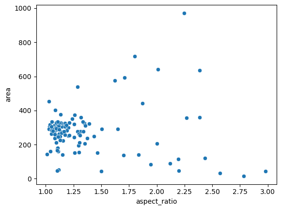
Scatter plot#
A very basic visualization of such datasets is the scatter plot.
sns.scatterplot(data=df, x="aspect_ratio", y="area");
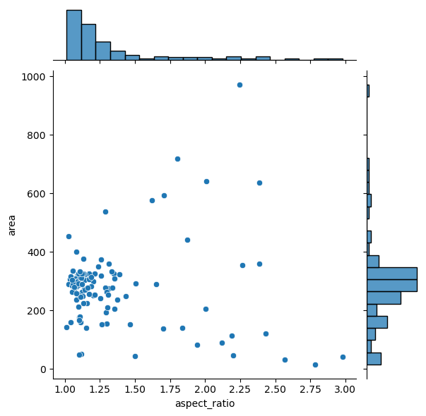
Plotting joint and marginal distributions#
The jointplot gives us more insights into the data, and has the same parameters though.
sns.jointplot(data=df, x="aspect_ratio", y="area");
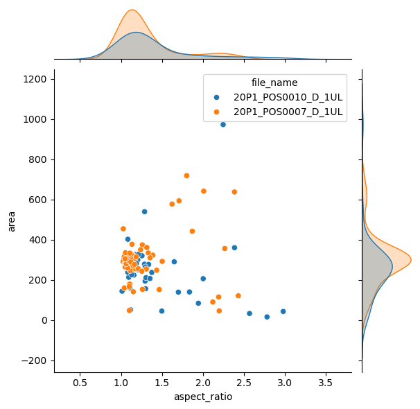
As expected, it is possible to separate groups by passing a categorical property to the hue argument. This has an effect on the marginal distribution, turning them from histogram to kde plots.
sns.jointplot(data=df,
              x="aspect_ratio",
              y="area",
              hue='file_name');
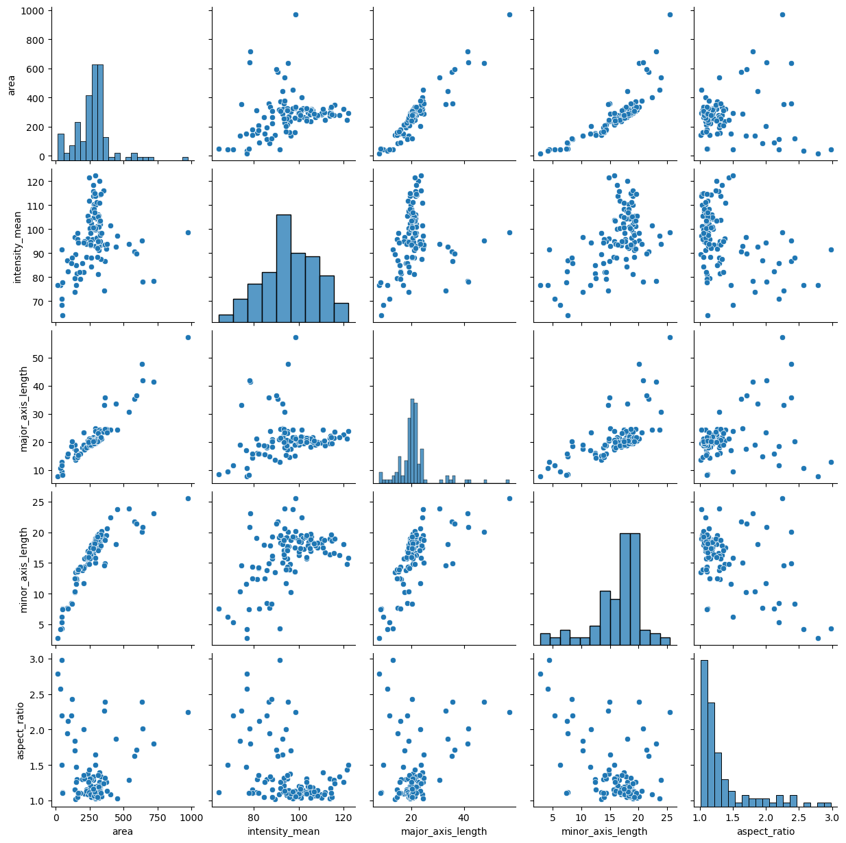
Plotting many distributions at once#
The above examples displayed a plot with relationship between two variables. This can be further expanded with the pairplot function which displays the relationship between all variables in a table. The result is a matrix of scatter plots with an univariate distribution of each variable on the diagonal.
sns.pairplot(data=df);
Exercise#
You may have noticed that the pairplot is redundant in some plots because the upper diagonal displays the same relationships rotated.
Redraw the pairplot to display only the lower diagonal of the plots.
Hint: explore the properties of the pairplot.