Brightness and Contrast#
When visualizing images in Jupyter notebooks it is important to show them in a way that a reader can see what we’re writing about. Therefore, adjusting brightness and contrast is important. We can do this by modifying the display range, the range of displayed grey values.
For demonstration purposes we use the cells3d example image of scikit-image.
import numpy as np
import matplotlib.pyplot as plt
from skimage.data import cells3d
The cells3d dataset is a 4D-image. Using array-acces we extract a single 2D slice and show it.
image = cells3d()[30,0]
image.shape
(256, 256)
plt.imshow(image, cmap='gray')
plt.colorbar()
<matplotlib.colorbar.Colorbar at 0x7f7244b69fd0>
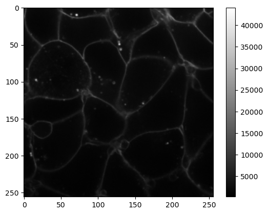
Notice that here the colorbar ranges from 0 to about 45000. The matplotlib plt.imshow() function adjusts the image contrast to the minimal and maximal values.
The minimal and maximal pixel values can also be obtained like this:
min_value = image.min()
max_value = image.max()
print('min value = ', min_value)
print('max value = ', max_value)
min value =  277
max value =  44092
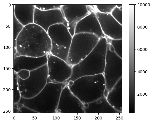
If we want to increase brightness, i.e., the perception that the image is emitting more light, we can configure the display range by setting its minimum vmin and maximum vmax. This improves visibility of the membranes.
plt.imshow(image, cmap='gray', vmax=10000)
plt.colorbar()
<matplotlib.colorbar.Colorbar at 0x7f72449dbd90>
Adjusting visualization independent from the specific image#
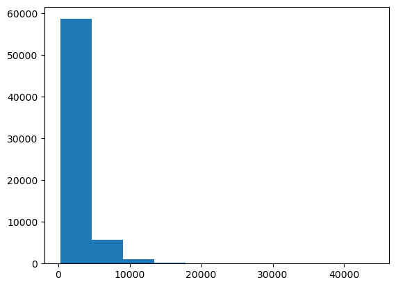
The next image we open may, or may not, have a similar grey-value range. Therefore, we could inspect the histogram of the image and guess a better threshold manually.
plt.hist(image.ravel())
(array([5.8622e+04, 5.6930e+03, 9.7800e+02, 1.6900e+02, 5.5000e+01,
        1.0000e+01, 5.0000e+00, 1.0000e+00, 2.0000e+00, 1.0000e+00]),
 array([  277. ,  4658.5,  9040. , 13421.5, 17803. , 22184.5, 26566. ,
        30947.5, 35329. , 39710.5, 44092. ]),
 <BarContainer object of 10 artists>)
Histograms of images are often shown with a log-scale.
plt.hist(image.ravel(), log=True)
(array([5.8622e+04, 5.6930e+03, 9.7800e+02, 1.6900e+02, 5.5000e+01,
        1.0000e+01, 5.0000e+00, 1.0000e+00, 2.0000e+00, 1.0000e+00]),
 array([  277. ,  4658.5,  9040. , 13421.5, 17803. , 22184.5, 26566. ,
        30947.5, 35329. , 39710.5, 44092. ]),
 <BarContainer object of 10 artists>)
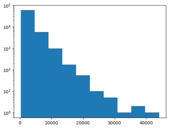
Obviously this image has a lot of dark grey values (< 20000) and little values > 40000.
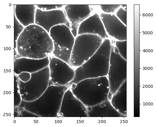
It might make sense to configure the visualization using a percentage. Assume we want to visualize the image in a way so that 95% of the pixels are within range. We can do this using numpy’s percentile method.
upper_limit = np.percentile(image, 95)
upper_limit
6580.0
plt.imshow(image, cmap='gray', vmax=upper_limit)
plt.colorbar()
<matplotlib.colorbar.Colorbar at 0x7f724466f400>
Exercise#
The cells3d dataset contains another channel showing the nuclei of the cells. Visualize it so that 99% of the lower grey values are visualized properly.
nuclei = cells3d()[30,1]
nuclei.shape
(256, 256)
