Part 1: Time series and other simple plots#
import warnings
warnings.simplefilter(action='ignore', category=FutureWarning) ## suppress annoying deprecation warnings

from datetime import datetime

import pandas as pd
import seaborn.objects as so
from matplotlib import style

import plotly.express as px
# Renaming columns for better axis labels in plots
col_rename = {
	'tavg': 'Temp_Avg_°C',
	'tmax': 'Temp_Max_°C',
	'tmin': 'Temp_Min_°C',
	'rhum': 'Rel_Humidity_%',
	'coco': 'Condition',
	'wspd': 'Wind_Speed_kmh',
	'prcp': 'Precipation_mm',
	'wdir': 'Wind_Direction_°',
	'pres': 'Air_pressure_hPa',
	'dwpt': 'Dew_point_°C'
}
weather_df = pd.read_csv('global_weather.csv', parse_dates=['time'], dtype={'wmo':str, 'station':str})
weather_df = weather_df.dropna()

weather_df.rename(columns=col_rename, inplace=True)
weather_df = weather_df.assign(Continent = weather_df["timezone"].str.split('/').str[0])  ## Get continent from timezone column

weather_df.loc[weather_df["name"] == "Berlin / Tempelhof",:].head()  ## Let's have a look at a single city (capital)
| name | country | region | wmo | icao | latitude | longitude | elevation | timezone | hourly_start | ... | Rel_Humidity_% | Condition | Temp_Avg_°C | Temp_Min_°C | Temp_Max_°C | Precipation_mm | Wind_Direction_° | Wind_Speed_kmh | Air_pressure_hPa | Continent | |
|---|---|---|---|---|---|---|---|---|---|---|---|---|---|---|---|---|---|---|---|---|---|
| 1412 | Berlin / Tempelhof | DE | BE | 10384 | EDDI | 52.4667 | 13.4 | 50.0 | Europe/Berlin | 1929-08-01 | ... | 80.0 | Overcast | 7.8 | 5.5 | 10.0 | 0.3 | 144.0 | 9.0 | 1007.8 | Europe |
| 1413 | Berlin / Tempelhof | DE | BE | 10384 | EDDI | 52.4667 | 13.4 | 50.0 | Europe/Berlin | 1929-08-01 | ... | 68.0 | Overcast | 9.4 | 6.3 | 13.3 | 0.0 | 132.0 | 7.6 | 1007.3 | Europe |
| 1414 | Berlin / Tempelhof | DE | BE | 10384 | EDDI | 52.4667 | 13.4 | 50.0 | Europe/Berlin | 1929-08-01 | ... | 64.0 | Overcast | 10.4 | 7.0 | 14.8 | 0.0 | 93.0 | 13.3 | 1005.8 | Europe |
| 1415 | Berlin / Tempelhof | DE | BE | 10384 | EDDI | 52.4667 | 13.4 | 50.0 | Europe/Berlin | 1929-08-01 | ... | 74.0 | Clear | 9.4 | 6.1 | 12.8 | 0.0 | 71.0 | 12.6 | 1010.0 | Europe |
| 1416 | Berlin / Tempelhof | DE | BE | 10384 | EDDI | 52.4667 | 13.4 | 50.0 | Europe/Berlin | 1929-08-01 | ... | 63.0 | Clear | 4.6 | -0.8 | 8.0 | 0.0 | 66.0 | 14.4 | 1017.0 | Europe |
5 rows × 28 columns
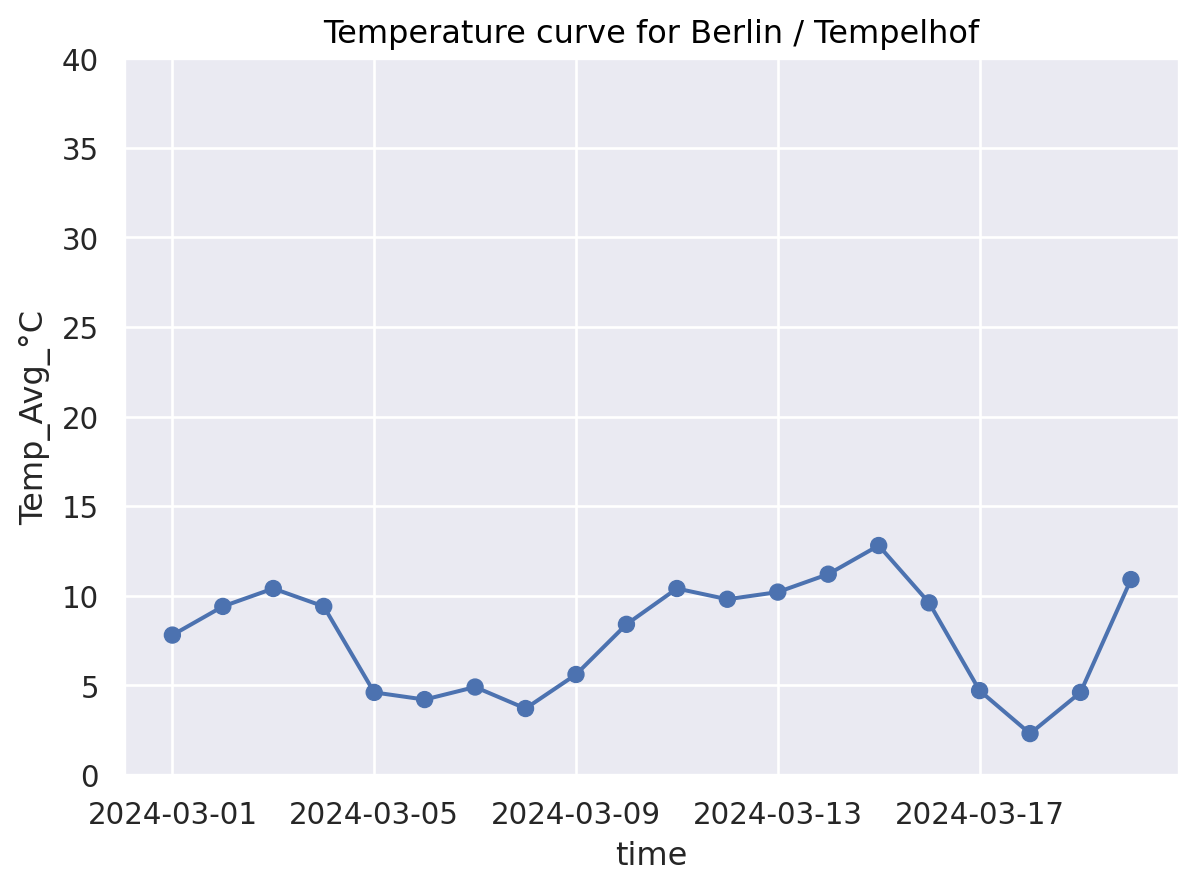
My first seaborn.objects plot#
so.Plot.config.display["scaling"] = 1.0 ## Adjust standard output size to your liking

(
    so.Plot(
		weather_df.loc[weather_df["name"] == "Berlin / Tempelhof",:],   ## Data layer (required)
		x="time", y="Temp_Avg_°C")                          			## Axis mapping layer (required)
    .add(so.Dot())                                                  	## Geometry layer (at least one required)
	.add(so.Line())                                                 	# Connect with lines (optional geometry layer)
	.limit(y=(0, 40))                                               	# Coordinate layer (optional: problem avoid free y-axis)
    .label(title="Temperature curve for Berlin / Tempelhof")            # Theme and label layers (optional)
)
Plotting distributions#
How is the temperature range over all cities?#
miss_timepoint= weather_df.time == datetime(2024, 3, 6) ## Simulate a missing timepoint and see what happens in plots
(
	so.Plot(weather_df[~miss_timepoint], x="time", y="Temp_Avg_°C")  ## Can you spot the missing time point?
    .add(so.Band()) 										# Geometry: Min-Max Band
	.add(so.Line(), 										# Geometry: Line
  	#!#    so.Agg(func=??)    								# Statistic: Mean
	   so.Agg(func='mean')    								# Statistic: Mean
	)
    .label(title="Average temperature for all cities")
)
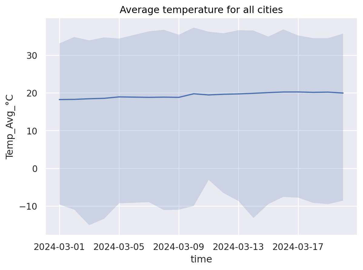
What are so.Band and so.Agg doing in the backgorund?#
weather_agg = pd.concat(
	[weather_df.loc[:,["time","Temp_Avg_°C"]].groupby(["time"]).min(), 	## so.Band - min-part
	weather_df.loc[:,["time","Temp_Avg_°C"]].groupby(["time"]).mean(), 	## so.Line, so.Agg
	weather_df.loc[:,["time","Temp_Avg_°C"]].groupby(["time"]).max(),	## so.Band - max-part
	weather_df.loc[:,["time","Temp_Avg_°C"]].groupby(["time"]).count()	## Let's check how many cities are aggregated
	],
	axis=1
)
weather_agg.columns = ["temp_min","temp_avg", "temp_max","nb_cities"]

weather_agg.head(n=10)
| temp_min | temp_avg | temp_max | nb_cities | |
|---|---|---|---|---|
| time | ||||
| 2024-03-01 | -9.6 | 18.207801 | 33.1 | 141 |
| 2024-03-02 | -11.0 | 18.255944 | 34.8 | 143 |
| 2024-03-03 | -15.1 | 18.426950 | 33.9 | 141 |
| 2024-03-04 | -13.4 | 18.536170 | 34.7 | 141 |
| 2024-03-05 | -9.3 | 18.916783 | 34.4 | 143 |
| 2024-03-06 | -9.4 | 18.864336 | 35.5 | 143 |
| 2024-03-07 | -9.0 | 18.797183 | 36.3 | 142 |
| 2024-03-08 | -11.1 | 18.853901 | 36.7 | 141 |
| 2024-03-09 | -11.0 | 18.795683 | 35.4 | 139 |
| 2024-03-10 | -10.0 | 19.744526 | 37.3 | 137 |
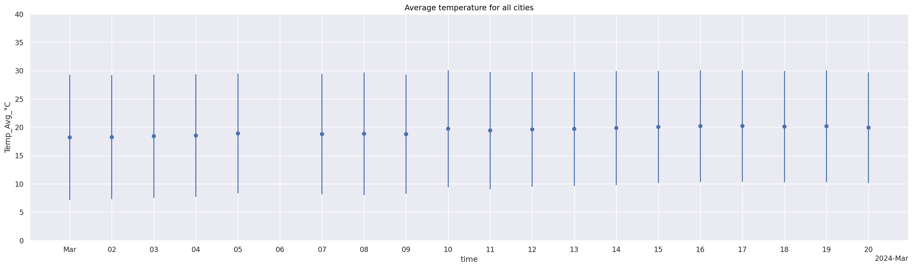
Another visualization (date is categorical, show data range not as min-max but as errorbar)#
Which visualization is better to see missing timepoint?
(
so.Plot(weather_df[~miss_timepoint], x="time", y="Temp_Avg_°C")	## Can you spot the missing time point?
	.add(so.Dot(), so.Agg()) 									# Geometry: Dot + Statistic: Mean
	#!# .add(so.???(), so.Est(errorbar=??)) 					# Geometry: Range + Statistic: Standard deviation
	.add(so.Range(), so.Est(errorbar="sd")) 					# Geometry: Range + Statistic: Standard deviation
	.limit(y=(0, 40))
	.layout(size=(20, 6)) 										# Increase the figure size for a better view
	.scale(
		x=so.Temporal().tick(upto=21).label(concise=True) 		# Increase the tick size and adjust tick labels for legibility
	)
	.label(title="Average temperature for all cities")
)
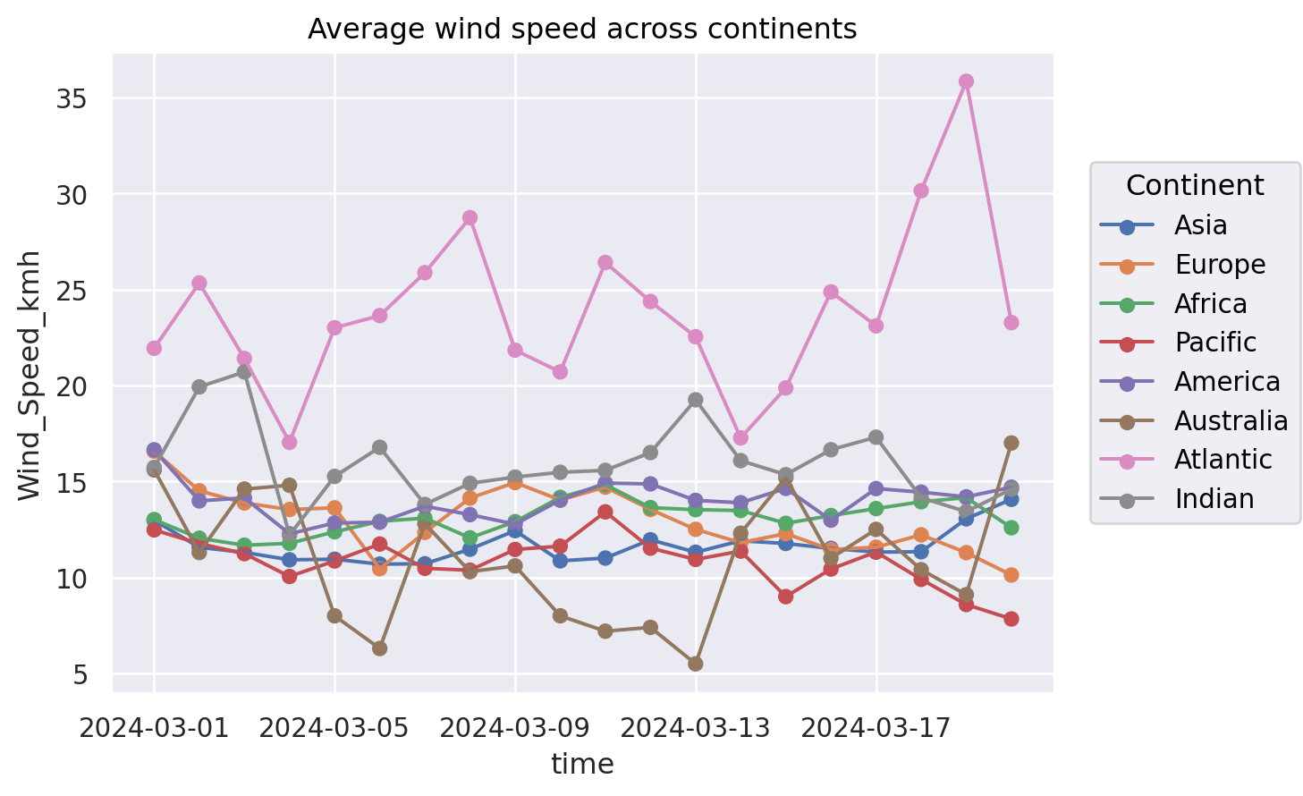
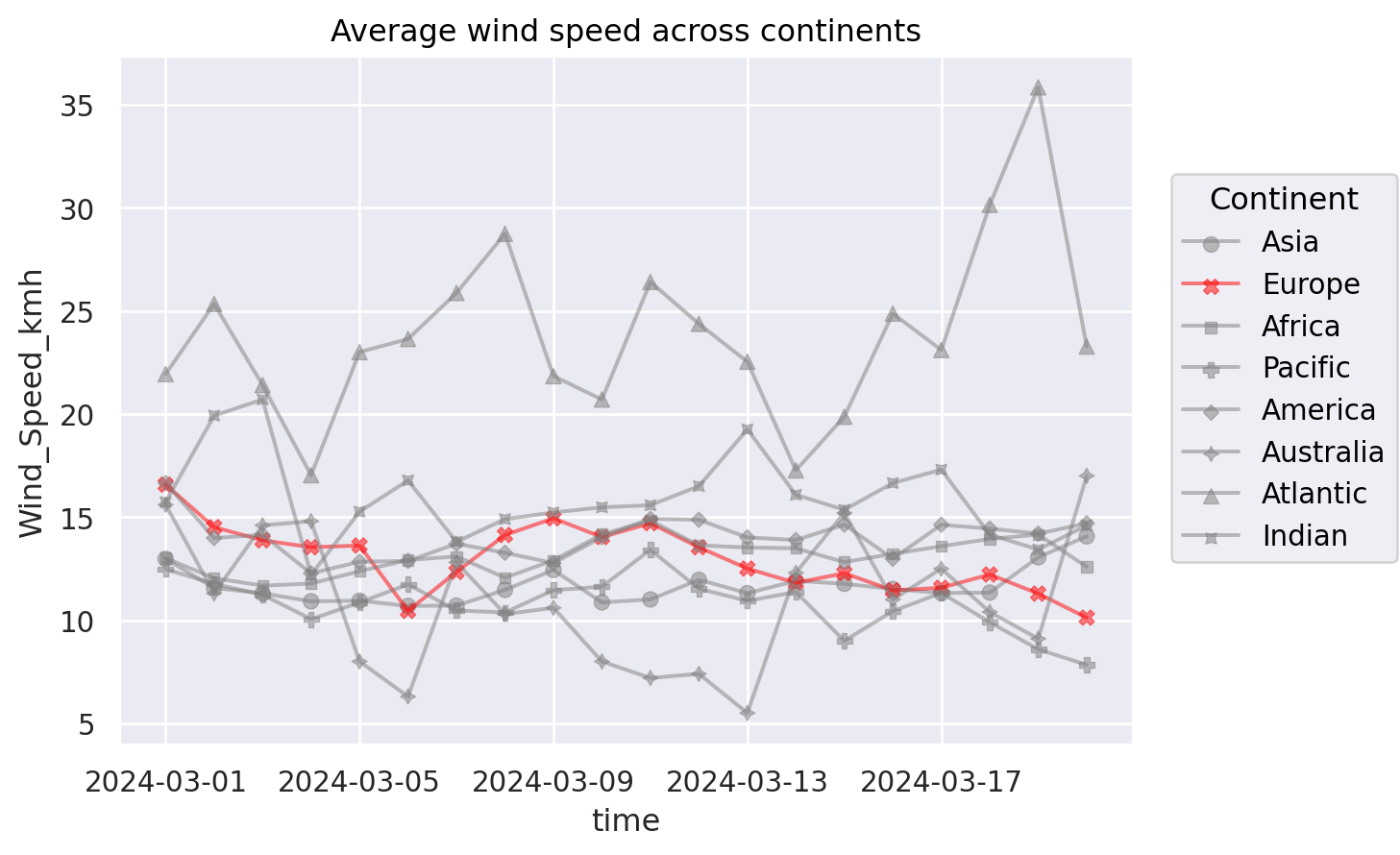
The problem of Spaghetti Plots#
(
    #!# so.Plot(weather_df, x="time", y=??, color=??)
    so.Plot(weather_df, x="time", y="Wind_Speed_kmh", color="Continent")
		.add(so.Dot(), so.Agg())
		.add(so.Line(), so.Agg())
		.label(title="Average wind speed across continents")
)
Alternatives: (1) Highlighting#
(
    so.Plot(weather_df, x="time", y="Wind_Speed_kmh", color="Continent")
		#!# .add(so.Dot(alpha=0.5), so.Agg(), marker=??)		# set transparency by alpha
		.add(so.Dot(alpha=0.5), so.Agg(), marker="Continent")		# set transparency by alpha
		.add(so.Line(alpha=0.5), so.Agg() )
		.scale(color=(							# Control the color scale
			"gray",								# Asia
		#!#	???,								# Highlight Europe
			"red",								# Highlight Europe
			"gray",								# Africa
			"gray",								# Pacific
			"gray",								# America
			"gray",								# Australia
			"gray",								# Atlantic
			"gray"								# Indian
			))
		.label(title="Average wind speed across continents")
)
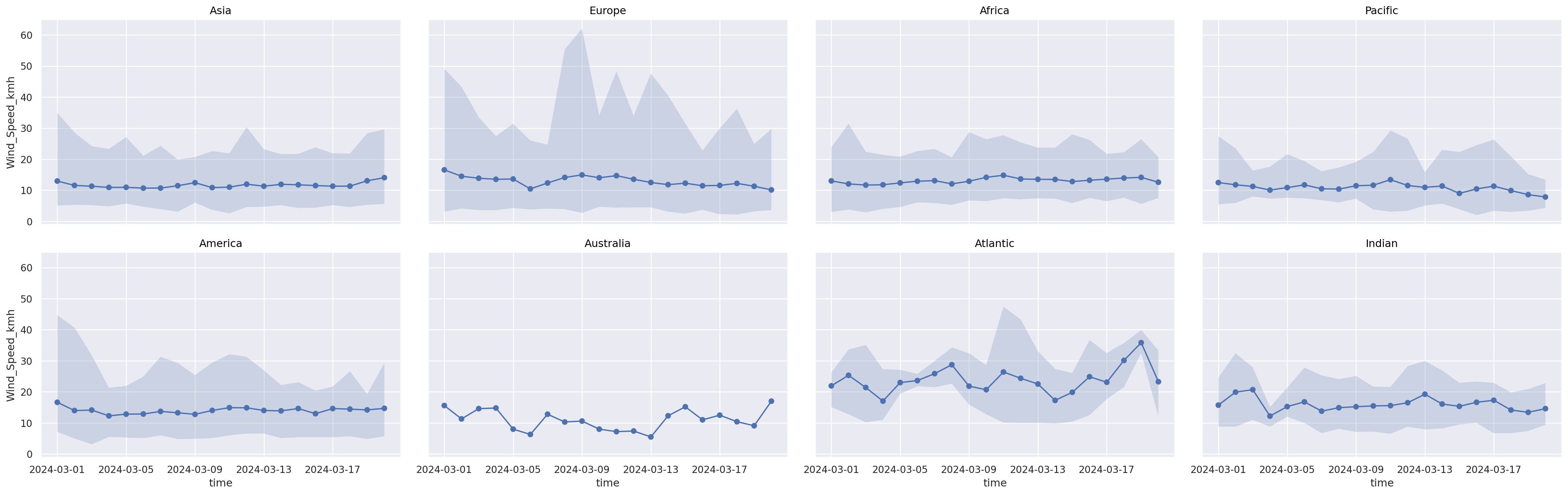
Alternatives: (2) Facet#
(
    so.Plot(weather_df, x="time", y="Wind_Speed_kmh")
		.add(so.Dot(), so.Agg())
		.add(so.Line(), so.Agg())
		.add(so.Band())
		#!# .facet(??, wrap=4)			# All you need for subplots
		.facet("Continent", wrap=4)		# All you need for subplots
		.layout(size=(25, 8))
)
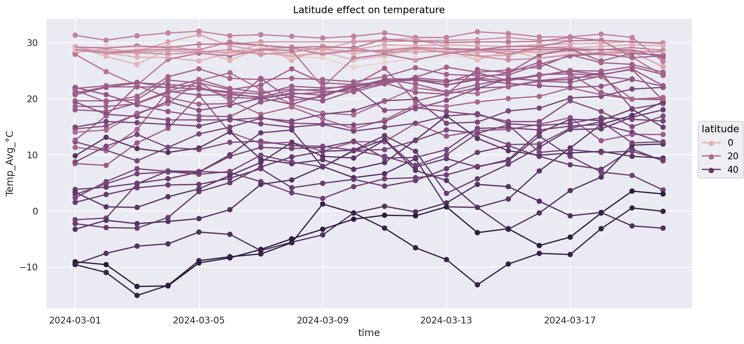
Example: relationship of temperature, date and latitude (south - north)#
How to not do it: spaghetti line plot#
(
#!#	so.Plot(weather_df.loc[weather_df["Continent"] == ???], x="time", y="Temp_Avg_°C", color=??)
	so.Plot(weather_df.loc[weather_df["Continent"] == "Asia"], x="time", y="Temp_Avg_°C", color="latitude")
    .add(so.Dot())
	.add(so.Line())
    .layout(size=(12, 6))
    .label(title="Latitude effect on temperature")
)
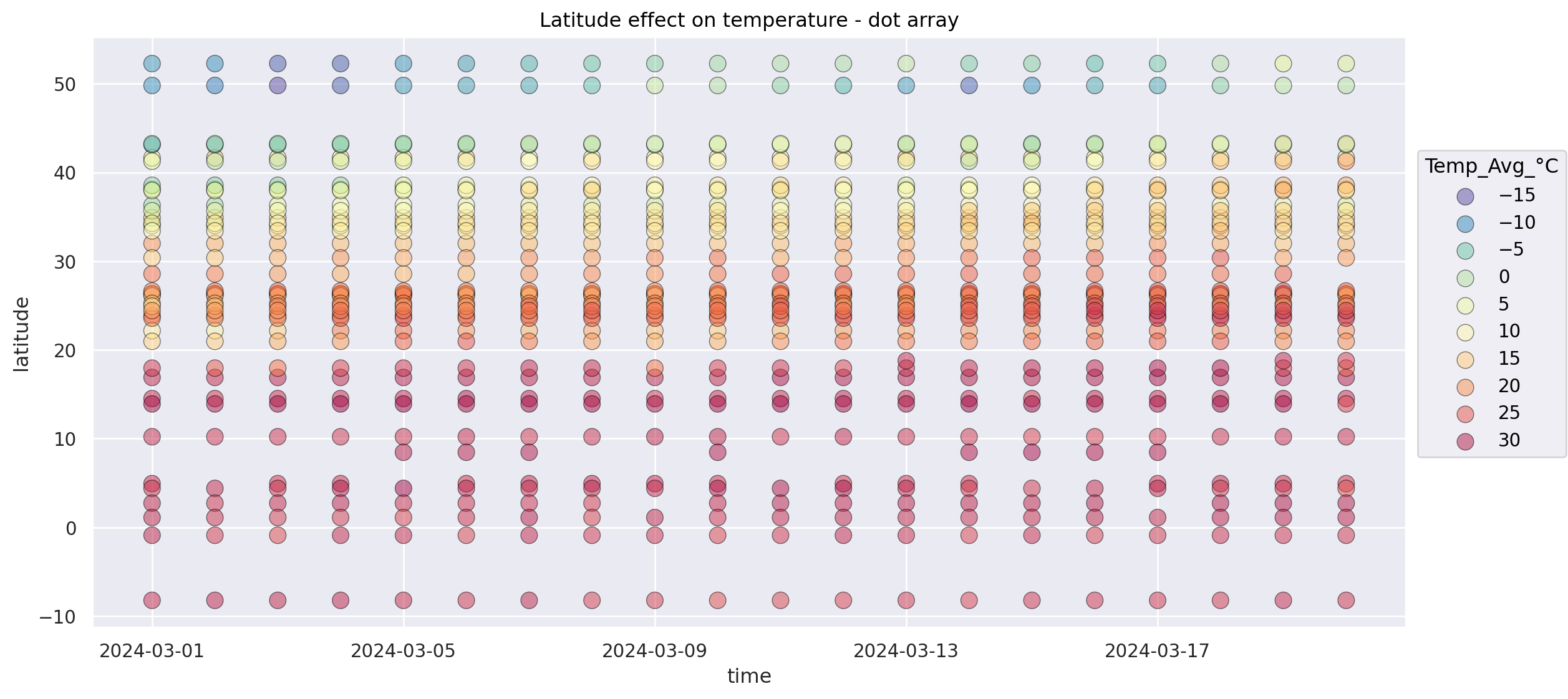
Alternative: Dot array and flip latitude and temperature axis#
(
	so.Plot(weather_df.loc[weather_df["Continent"] == "Asia"], x="time", y="latitude", color="Temp_Avg_°C")
    #!# .add(so.??(alpha=0.5, pointsize=10, edgecolor="black"))
    .add(so.Dot(alpha=0.5, pointsize=10, edgecolor="black"))
	.scale(
	#!# color = so.Continuous(??).tick(upto=10) # Important: choosing an intuitive colormap (https://seaborn.pydata.org/tutorial/color_palettes.html)
        color = so.Continuous("Spectral_r").tick(upto=10) # Important: choosing an intuitive colormap (https://seaborn.pydata.org/tutorial/color_palettes.html)
        )
    .layout(size=(12, 6))
    .label(title="Latitude effect on temperature - dot array")
)
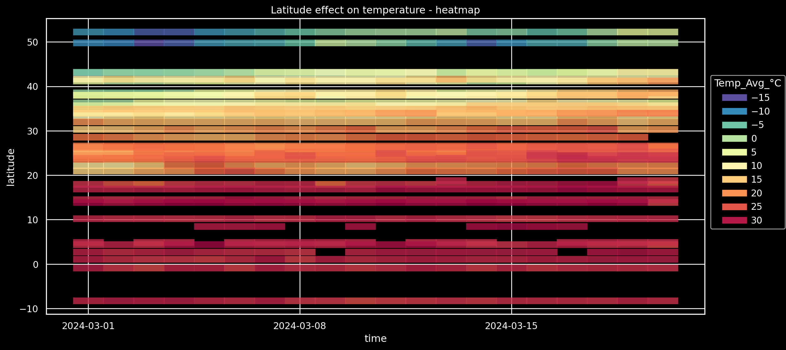
Alternative: Heatmap-like (via Dash)#
(
    so.Plot(weather_df.loc[weather_df["Continent"] == "Asia"], x="time", y="latitude", color="Temp_Avg_°C")
	#!# .add(so.??(alpha=0.8, width=0.8,  linewidth=8))
	.add(so.Dash(alpha=0.8, width=0.8,  linewidth=8))
	.scale(
        color=so.Continuous("Spectral_r").tick(upto=10)
        )
    .layout(size=(12, 6))
#!#	.theme({**style.library[??]}) # Increasing visibility on screens?
    .theme({**style.library["dark_background"]}) # Increasing visibility on screens?
    .label(title="Latitude effect on temperature - heatmap")
)
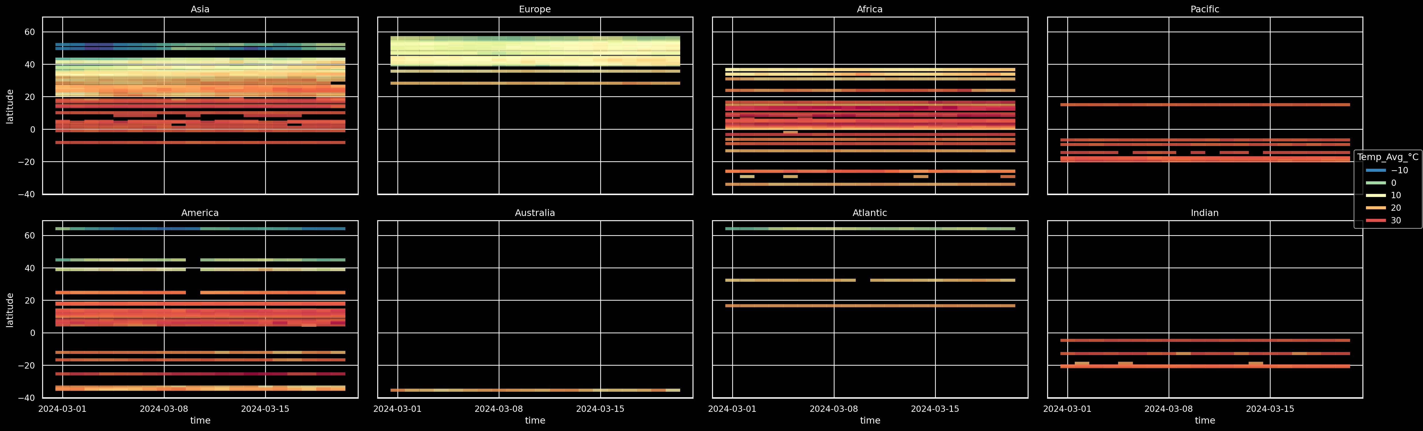
On all continents? no problem: facet#
(
    so.Plot(weather_df, x="time", y="latitude", color="Temp_Avg_°C")
    .add(so.Dash(alpha=0.8, width=0.8,  linewidth=4))
	.scale(
        color=so.Continuous("Spectral_r").tick(upto=10)
        )
	#!# .facet(??, wrap=4).layout(size=(25, 8))
	.facet("Continent", wrap=4).layout(size=(25, 8))
	.theme({**style.library["dark_background"]})
)
Example: what to do if you want to plot 3-4 variables?#
interactive 3D plot with plotly#
fig = px.scatter_3d(weather_df, x="Dew_point_°C", y="latitude", z="Temp_Avg_°C",
                    #!# color=??, ##  for fourth dimension
                    color="Rel_Humidity_%", ##  for fourth dimension
					opacity=0.7)
fig.update_traces(marker_size = 2)  # Make dots smaller
fig.update_layout(margin=dict(l=0, r=0, b=0, t=0)) # Reduce figure margins
fig.show()